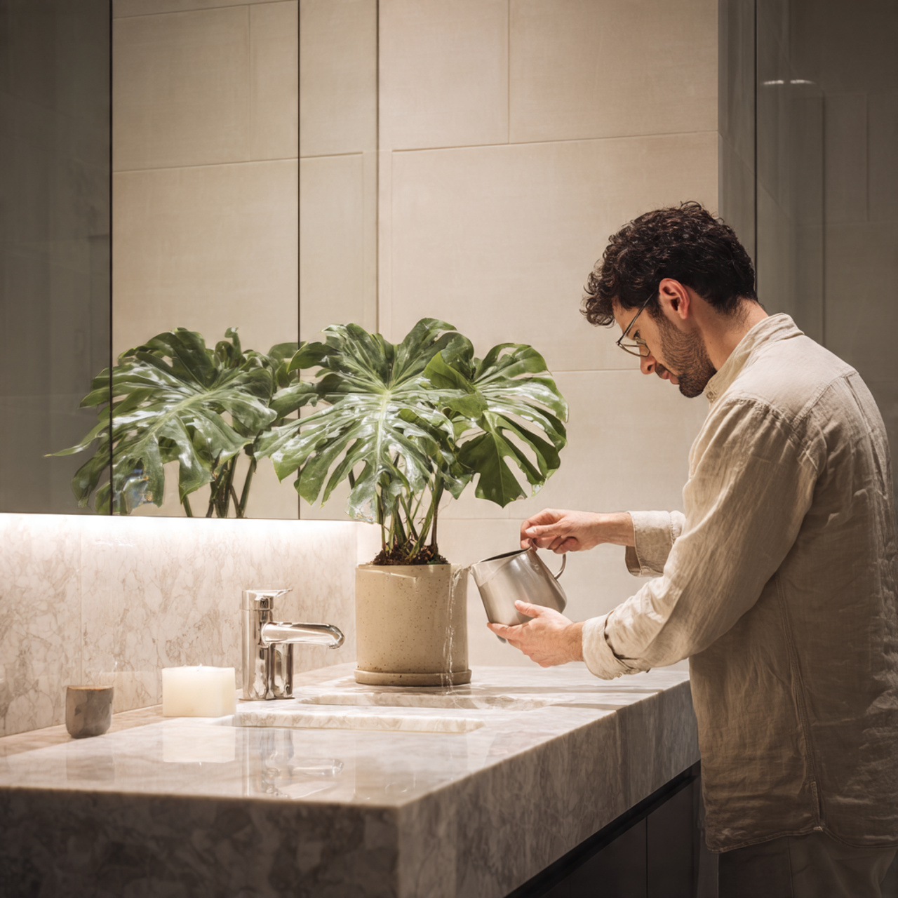
25 Best Sherwin Williams Color Palettes Ideas for Modern Interiors
Sherwin Williams Color Palettes Ideas are the starting point for transforming any space from mundane to magnificent. Choosing the right colors is an act of creativity, allowing you to infuse your personal style and desired atmosphere into your home or office. This guide is designed to inspire you with a vast variety of beautiful and coordinated palettes, showcasing the depth and versatility of the Sherwin-Williams collection.
Whether you’re dreaming of a tranquil coastal retreat, a vibrant modern apartment, or a cozy farmhouse aesthetic, the range of available color combinations offers endless possibilities. Forget about overwhelming color chips; focus instead on these curated collections that guarantee a harmonious and visually stunning result, sparking your next great design project.
Sherwin Williams Color Palettes Ideas for Every Design Style
The following sections delve into a diverse range of Sherwin Williams Color Palettes Ideas, organized to inspire creativity across different moods and architectural styles. These curated combinations move beyond single-color decisions, offering complete design narratives that ensure a cohesive flow throughout your entire space.
From sophisticated neutrals that provide a timeless backdrop to bold, saturated hues that make a dramatic statement, these ideas are segmented by the feeling they evoke. Explore palettes perfect for creating a relaxing bedroom sanctuary, a productive home office, or a welcoming living room that instantly feels like home.
25 Ideas Section
Coastal Calm Palette Ideas
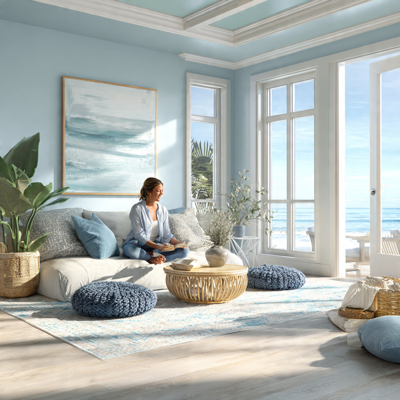
Embrace the serene atmosphere of the seaside with a palette built around soft, watery blues and crisp whites. This approach focuses on light and airiness, using colors like Sea Salt (SW 6204) paired with Pure White (SW 7005) to mimic the feeling of sun reflecting off the ocean. The subtle shifts in the blues and greens provide depth without ever feeling heavy, creating an ideal tranquil escape within your four walls.
To complete this peaceful setting, consider introducing natural wood tones and sandy beige accents. Using a grounding color such as Accessible Beige (SW 7036) as a complement can tie the whole look together. These specific Sherwin Williams color palettes ideas are perfect for spaces dedicated to relaxation, such as sunrooms, bathrooms, and primary bedrooms.
Modern Farmhouse Palette Ideas
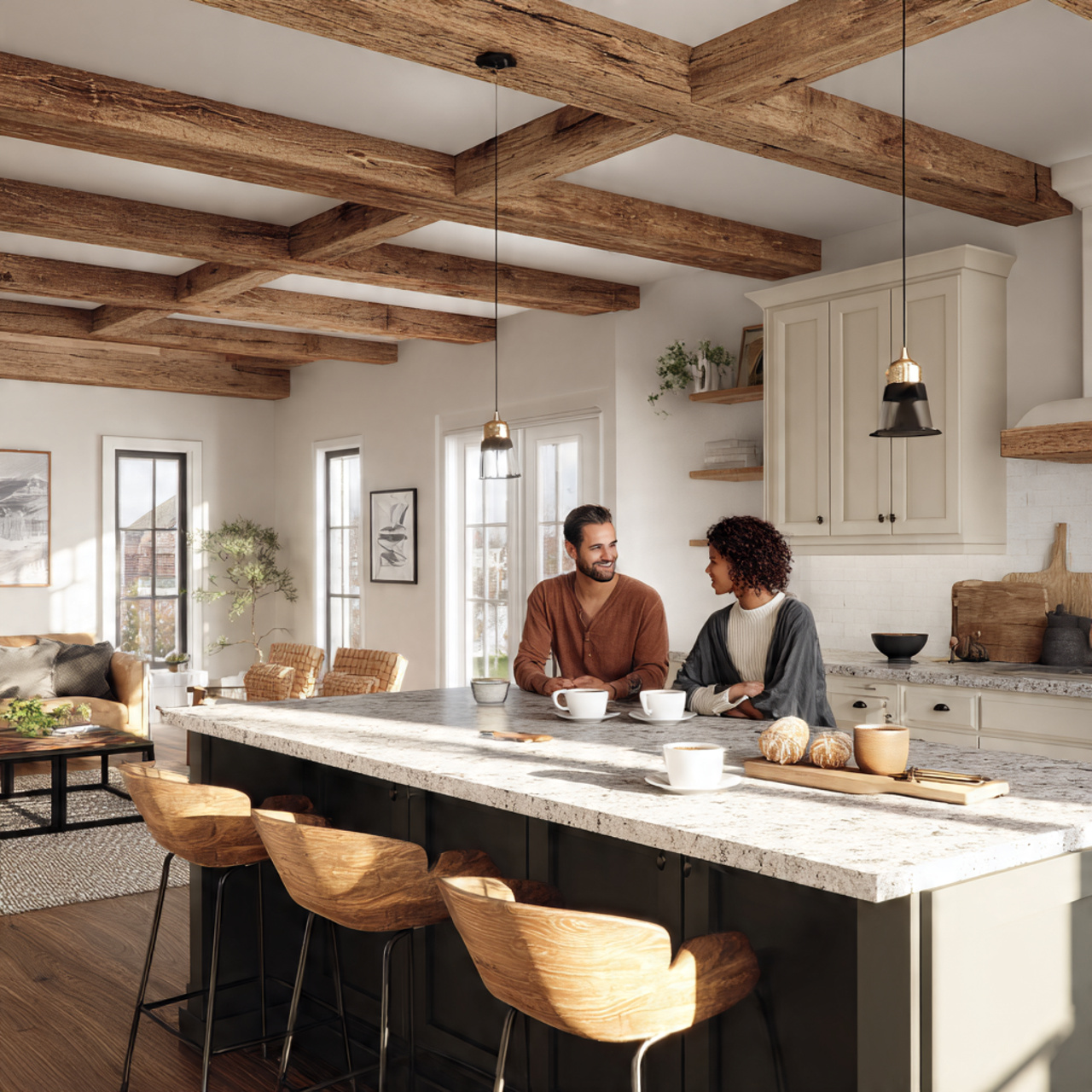
The modern farmhouse aesthetic balances rustic charm with clean, contemporary lines, and the color palette is key to its success. Start with a foundational white that has a hint of warmth, like Alabaster (SW 7008), to soften the starkness often associated with modern design. This foundational hue provides the perfect canvas for layering natural textures.
Introduce deep, moody accents with colors like Iron Ore (SW 7069) or Tricorn Black (SW 6258) for trim or accent walls, grounding the entire look. The contrast between the warm white and the dark accent creates a sophisticated, yet cozy feel. These Sherwin Williams color palettes ideas celebrate simplicity and functionality while maintaining a welcoming, country-inspired spirit.
Urban Industrial Palette Ideas
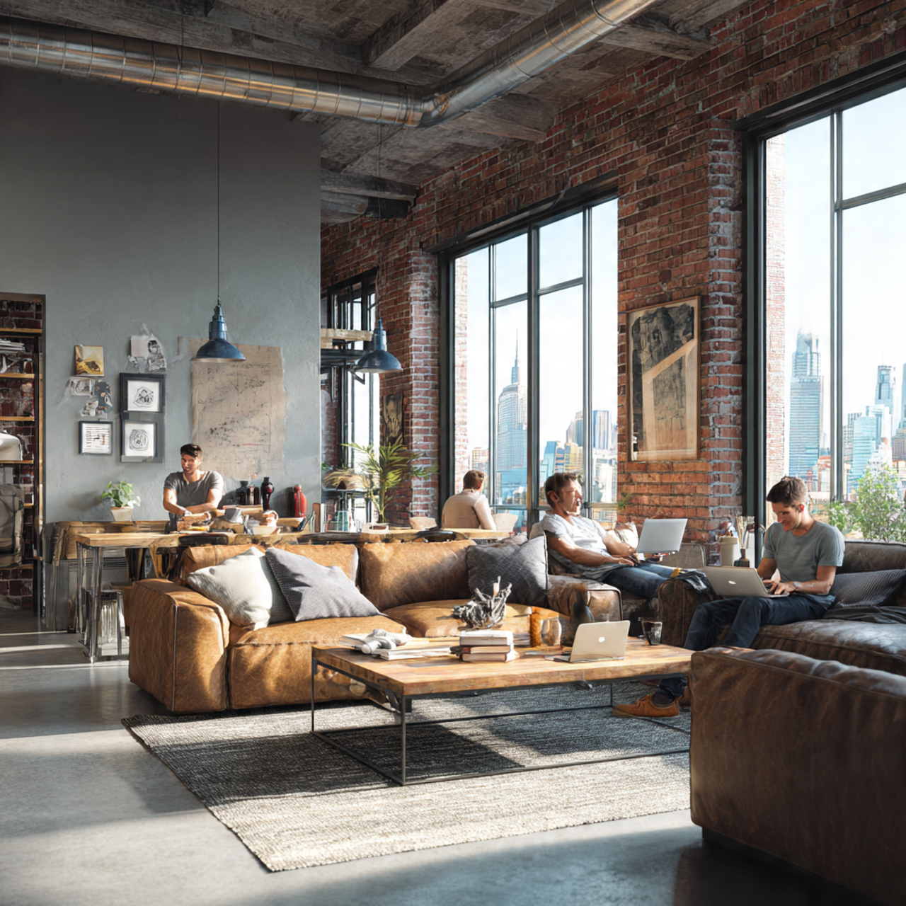
Achieving an urban industrial look means embracing raw, earthy tones and metallic finishes. The palette should lean heavily on sophisticated grays and muted neutrals that evoke concrete, steel, and exposed brick. Try pairing a rich, medium-gray like Dorian Gray (SW 7017) with a complementary darker shade like Gibraltar (SW 6257) to add definition and depth.
The idea here is to create a chic, slightly rugged atmosphere, often punctuated by pops of warm leather or copper accents. Using an off-white, slightly dusty color for the ceiling, such as Shoji White (SW 7012), prevents the space from feeling too dark while maintaining the industrial edge. These specific Sherwin Williams color palettes ideas thrive in open-concept lofts and modern apartment settings.
Desert Oasis Palette Ideas
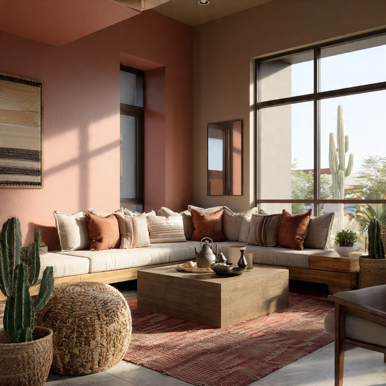
The desert oasis palette is inspired by the natural landscape of the American Southwest: warm sands, deep sunsets, and dusty succulents. It centers on sun-baked hues, including terra cottas, muted pinks, and warm golds. Start with a versatile, sandy neutral like Kilim Beige (SW 6106) as the main wall color.
Layer in richer, deeper accent tones that mimic desert flora and rock formations, such as a burnt orange or a muted sage green. Introducing a deep, slightly muddied teal can provide a stunning, cooling contrast, like a hidden pool in the arid landscape. These Sherwin Williams color palettes ideas are excellent for adding warmth and an organic, earthy feel to any living area.
Scandinavian Simplicity Palette Ideas
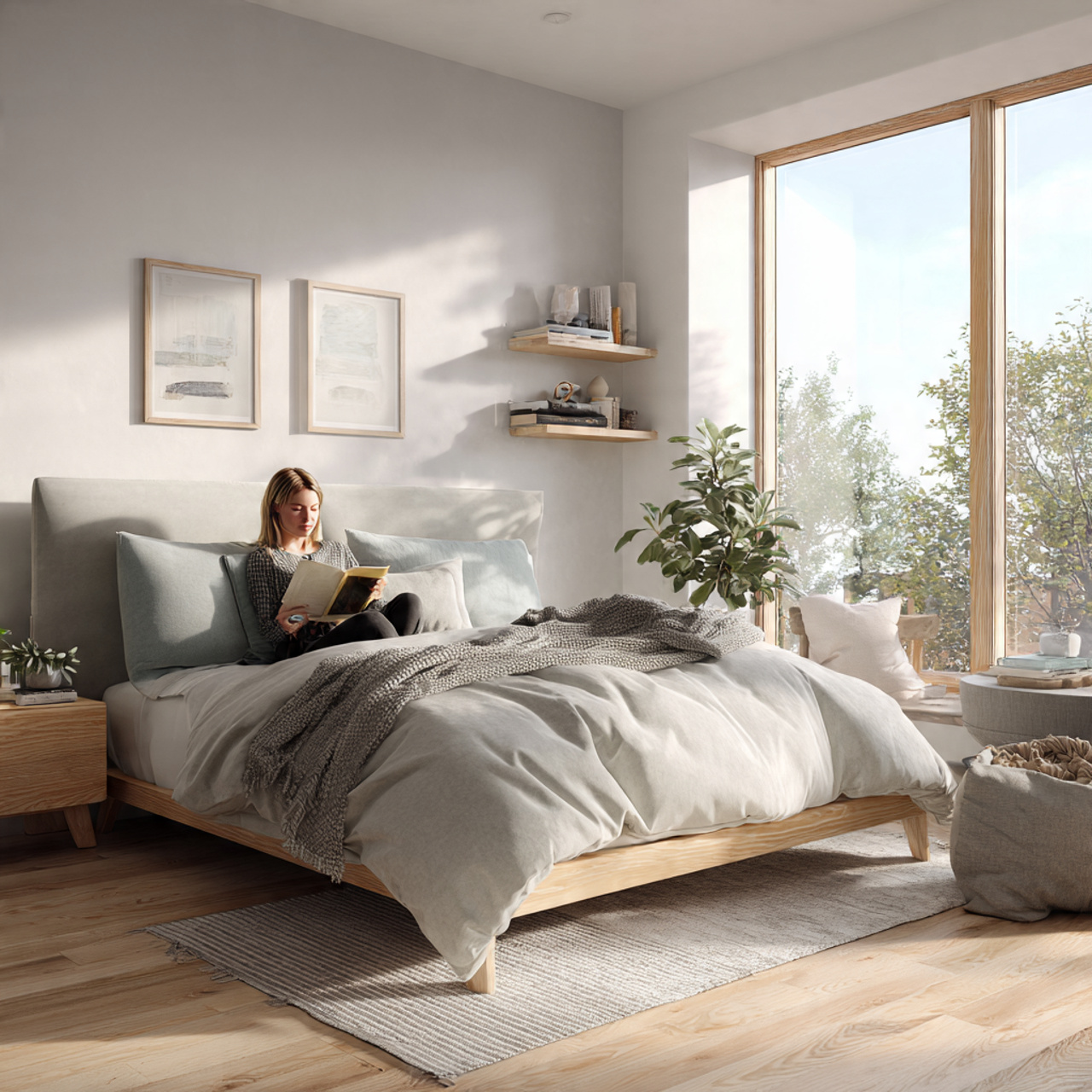
The Scandi aesthetic champions minimalism, functionality, and abundant natural light, making the color palette inherently light and airy. The core idea is to use soft, cool-toned neutrals, like light grays and cool whites, to maximize the feeling of space. Repose Gray (SW 7015) is a popular choice for its beautiful balance of warm and cool undertones.
To prevent the space from feeling sterile, introduce natural wood tones and small, carefully selected areas of subtle color. A very pale blue or a dusty lavender, used sparingly, adds gentle interest without breaking the minimalist rule. These Sherwin Williams color palettes ideas are perfect for creating serene, clutter-free environments focused on well-being.
Mid-Century Modern Palette Ideas
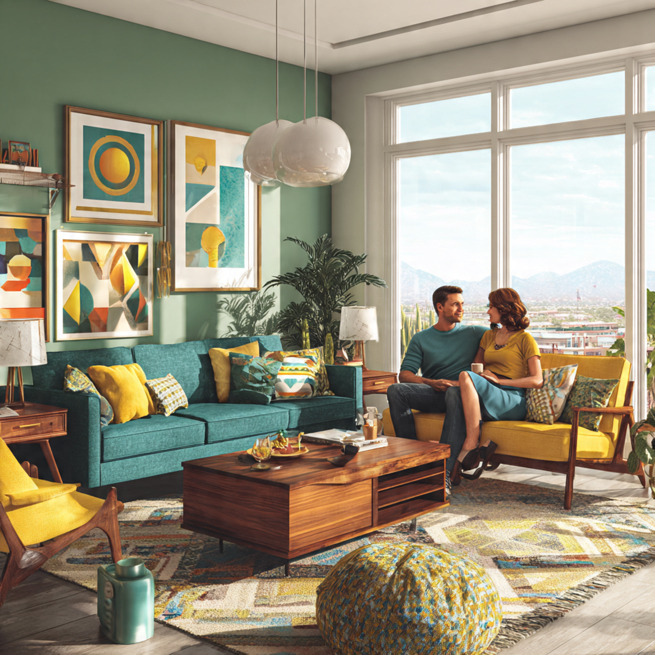
Mid-Century Modern design is synonymous with bold, saturated colors paired with clean, geometric lines. The palettes draw inspiration from nature, but with a punchy, almost retro twist. Think avocado green, mustard yellow, and deep teal. Consider using a neutral backdrop, like Agreeable Gray (SW 7029), on the majority of the walls to let the furniture shine.
The accent walls or architectural features are where the bright colors come into play. A rich, welcoming hue like Rookwood Sash Green (SW 2810) or a vibrant orange-red can define the space. These Sherwin Williams color palettes ideas celebrate sophisticated color-blocking and the use of natural materials like walnut and teak.
Boho Chic Sanctuary Palette Ideas
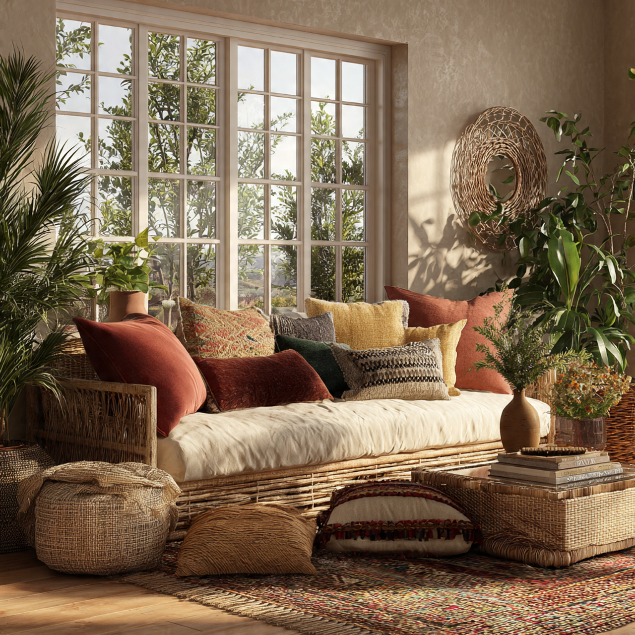
The Boho Chic palette is all about warmth, texture, and a global, collected feel, relying heavily on organic and earthy tones. The foundation should be a creamy, warm white or light tan that complements natural fibers like rattan and macramé. Accessible Beige (SW 7036) or even a slightly pink-toned neutral works beautifully here.
Layering is the main idea: introduce jewel-toned accents in textiles, such as deep emerald or sapphire blue, to add richness and personality. The palette should feel relaxed, eclectic, and inviting, much like a well-traveled home. These Sherwin Williams color palettes ideas encourage mixing and matching patterns and colors freely within the earthy base.
Jewel Tone Elegance Palette Ideas
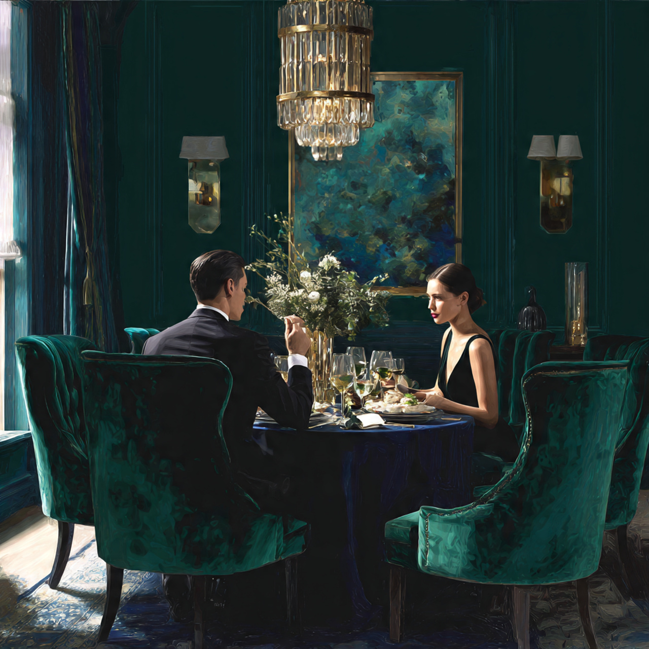
For a space that exudes luxury and drama, jewel tones are the ultimate choice for Sherwin Williams color palettes ideas. These deeply saturated hues—think emerald green, sapphire blue, ruby red, and amethyst purple—create a rich, velvety atmosphere. They work particularly well in dining rooms, powder rooms, or master retreats.
To balance the intensity, pair the main jewel tone with a crisp, true white for trim or a very dark, grounding neutral like black or navy. Using a deep velvet blue like Naval (SW 6244) on the walls and contrasting it with metallic gold accents instantly elevates the room. This palette is designed to make a dramatic and elegant statement.
Tranquil Spa Bedroom Palette Ideas
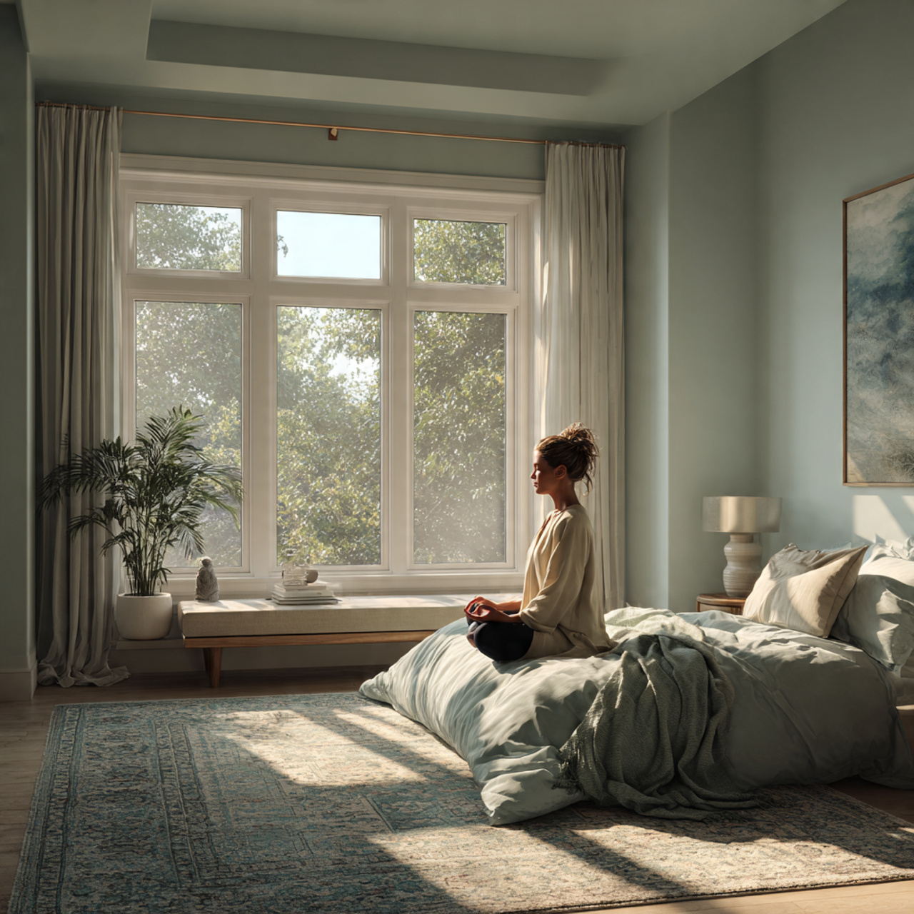
Creating a bedroom that feels like a peaceful spa relies on soft, muted, and cool-toned colors that promote relaxation and rest. Focus on pale greens, dusty blues, and gentle grays, avoiding anything too bright or stimulating. A calming shade like Sea Salt (SW 6204), which shifts between blue and green depending on the light, is an ideal choice.
Keep the trim and ceiling a soft, non-stark white to maintain the airy feeling. The idea is to create a seamless transition between the walls and the ceiling, enhancing the feeling of infinite calm. These Sherwin Williams color palettes ideas should feel understated and supportive of restorative sleep.
Warm Rustic Kitchen Palette Ideas
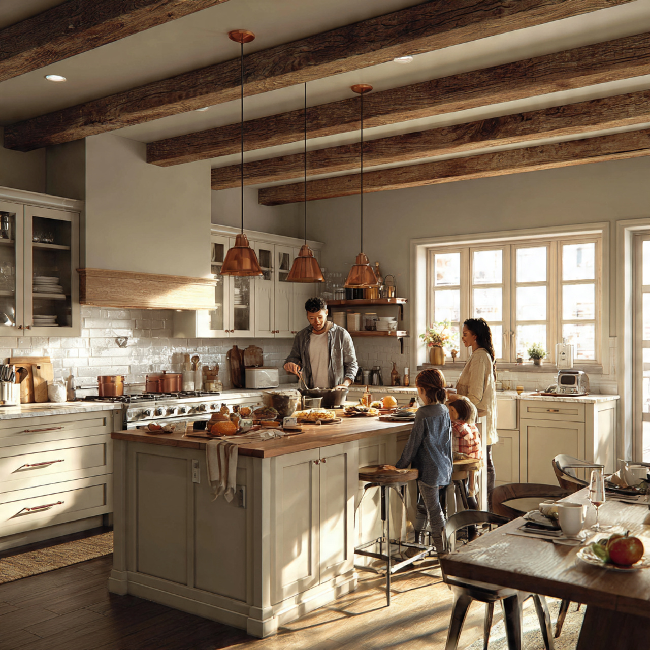
A warm rustic kitchen palette uses colors that feel organic, cozy, and slightly worn, perfect for a family-focused gathering space. The foundation often starts with a creamy off-white or a light, earthy gray, allowing reclaimed wood, exposed beams, or copper fixtures to shine. Try a versatile hue like Greek Villa (SW 7551) on the cabinetry.
The accent colors should be deep and comforting, such as a rich, muted brown or a soft sage green on an island or lower cabinets. The core idea is creating a sense of history and permanence, using colors that feel naturally aged. These Sherwin Williams color palettes ideas pair perfectly with matte finishes and textured surfaces.
Deep Forest Green Palette Ideas
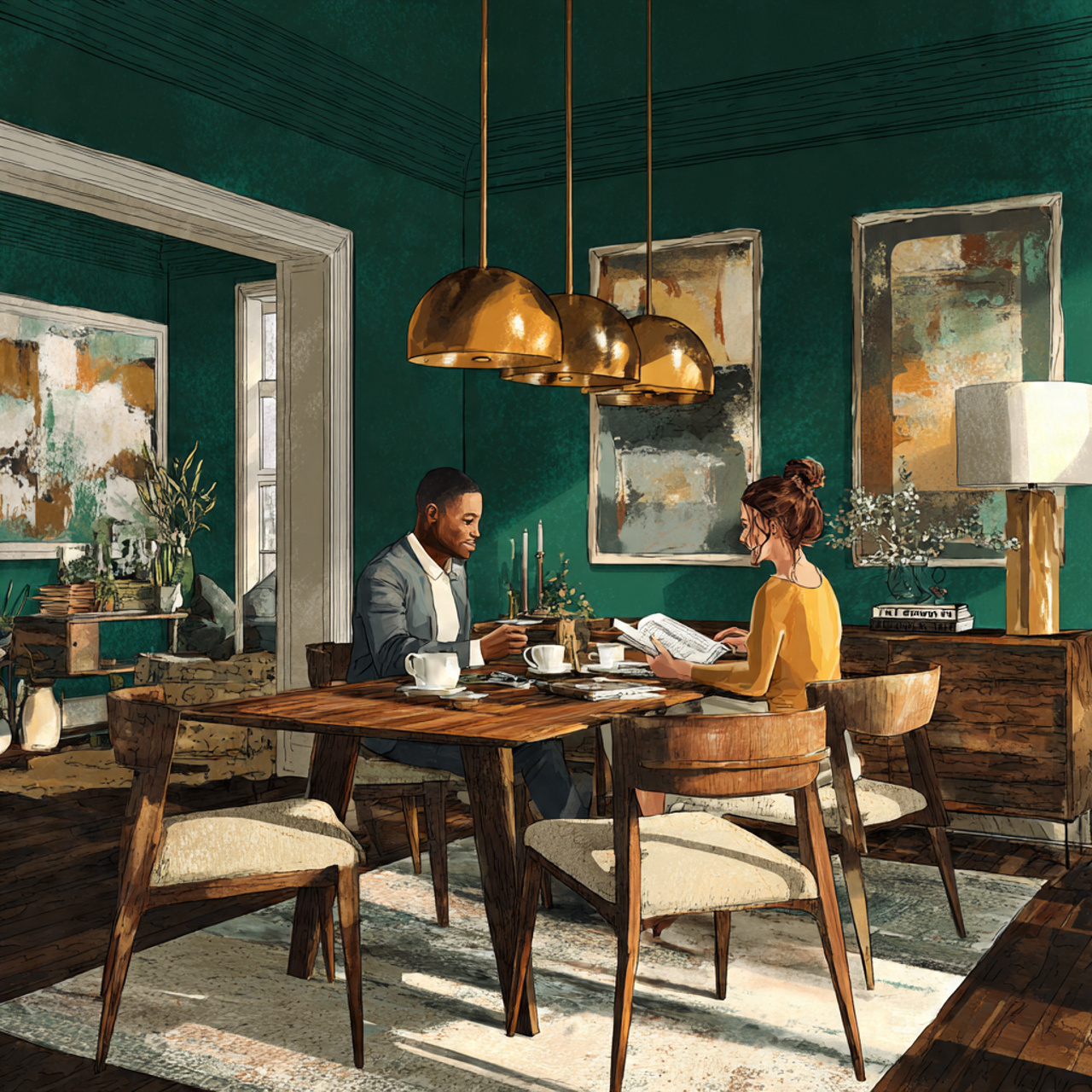
This concept involves leveraging the lush, grounding power of deep greens to bring the tranquility of nature indoors. A rich, sophisticated shade like Evergreen Fog (SW 9130) or even a darker color like Secret Garden (SW 6181) works beautifully in studies, dining areas, or feature walls. The depth of the color adds immediate architectural interest.
To maintain balance, pair the deep green with a contrasting light color, such as a soft, creamy white, or a pale gold for a luxurious feel. The use of wood tones is essential here, as they complement the organic nature of the green. These Sherwin Williams color palettes ideas evoke a feeling of sophisticated quietude and natural immersion.
Sun-Drenched Mediterranean Palette Ideas
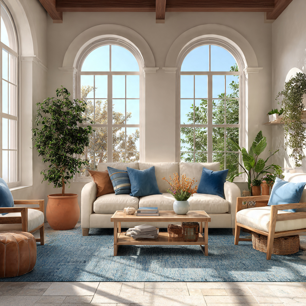
Inspired by the coastal towns and ancient architecture of the Mediterranean, this palette is characterized by warm whites, deep blues, and pops of bright, sunny colors. The main wall color should be a bright, creamy white that reflects light beautifully, like Pure White (SW 7005), which mimics sun-bleached stucco.
The accent color is almost always a vibrant blue, reminiscent of the Aegean Sea, used on shutters, doors, or accent ceramics. Introducing elements of terracotta or olive green adds the necessary earthy contrast. These Sherwin Williams color palettes ideas create a feeling of perpetual summer, brightness, and casual elegance.
Historical Colonial Palette Ideas
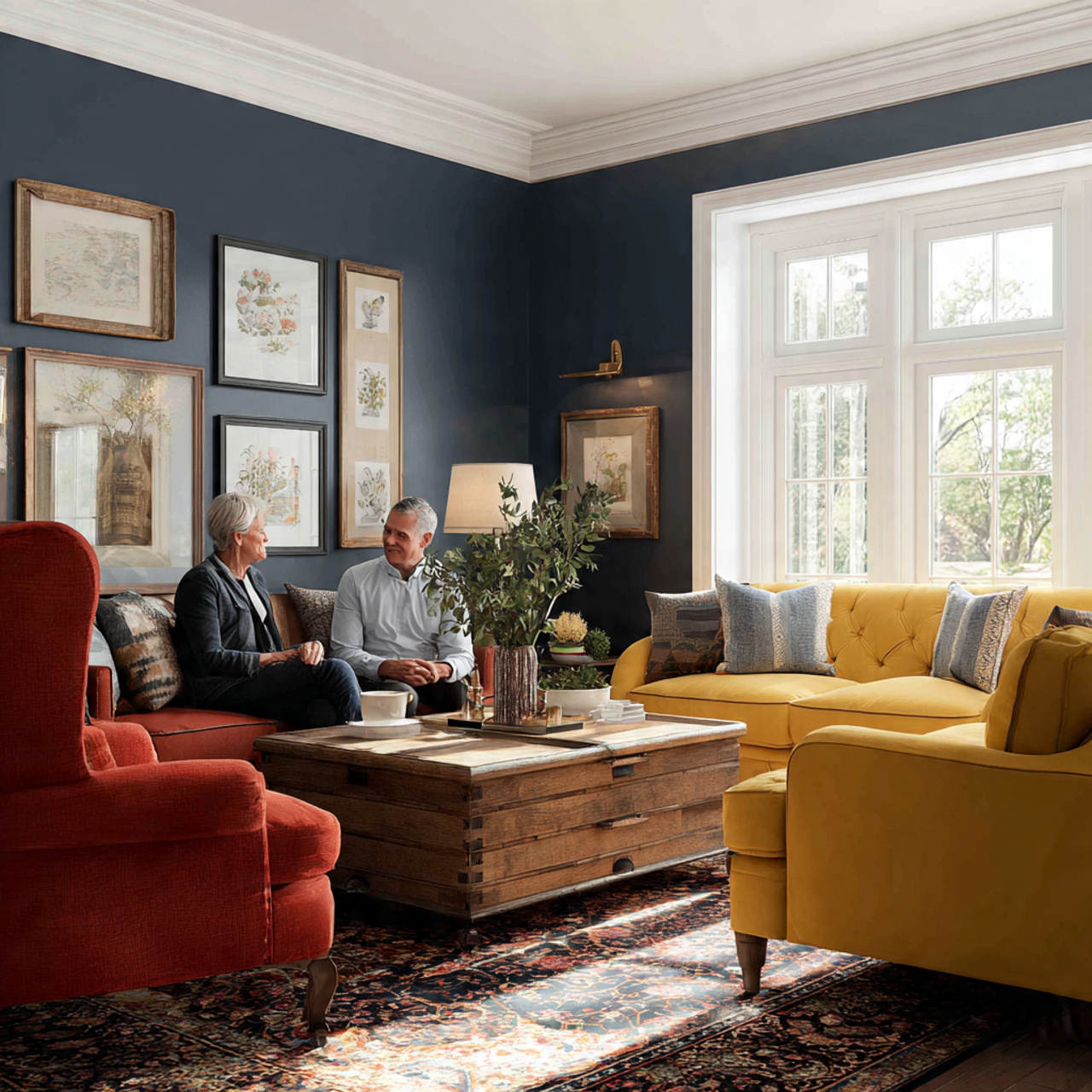
The Colonial palette is rooted in history, featuring colors that are rich, muted, and often drawn from natural mineral pigments. Think deep, dusty blues, barn reds, and mustard yellows, all used with a sense of restrained formality. Use a historically accurate shade like Williamsburg Wythe Blue (SW 7602) in a formal dining or living area.
The overall idea is to create a sophisticated environment that feels grounded and traditional. The colors are never overtly bright but instead possess a deep, satisfying saturation. Pairing these traditional colors with classic white trim maintains a crisp delineation between architectural elements. These Sherwin Williams color palettes ideas emphasize timeless design.
Grayscale Sophistication Palette Ideas
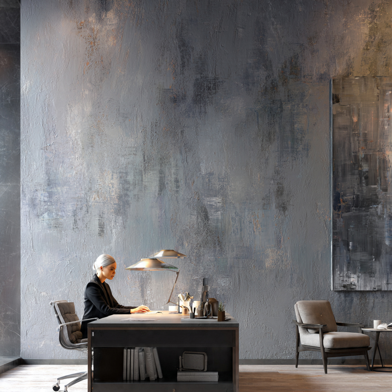
Grayscale sophistication relies on a carefully selected range of grays, from nearly white to deep charcoal, to create depth and texture without needing any other color. This approach is minimalist yet incredibly chic, focusing on the interplay of light and shadow. Start with a pale gray like Light French Gray (SW 0055) as the main wall color.
Use a darker, almost black-gray, like Iron Ore (SW 7069), on architectural elements or a single wall to add drama. The idea is to layer different sheens—matte, satin, gloss—to differentiate the grays. These Sherwin Williams color palettes ideas work exceptionally well in modern homes where texture is provided through materials like linen and concrete.
Vibrant Global Inspired Palette Ideas
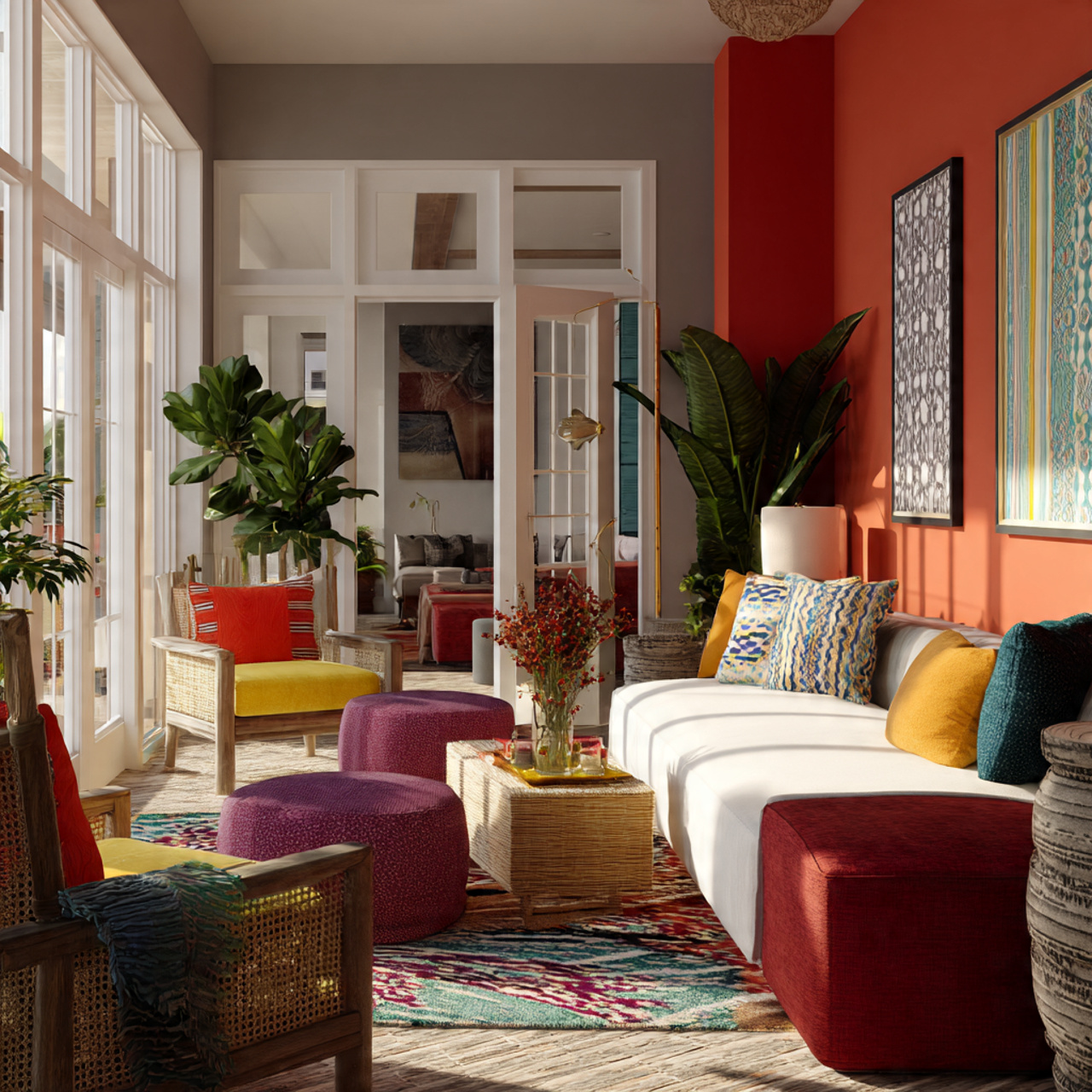
A vibrant, globally inspired palette is a celebration of strong, contrasting colors and rich cultural patterns. The colors are often bold and highly saturated, taking cues from textiles and art from around the world. A warm, slightly spicy color like Cavern Clay (SW 7701) can serve as an energetic backdrop.
The idea is to introduce bright secondary colors through smaller accents, such as a punchy turquoise or a fiery orange. This palette is designed to feel lively, inviting, and full of personality, perfect for creative spaces or dynamic entryways. These Sherwin Williams color palettes ideas encourage bold, expressive choices in decor.
Earthy Terracotta and Clay Palette Ideas
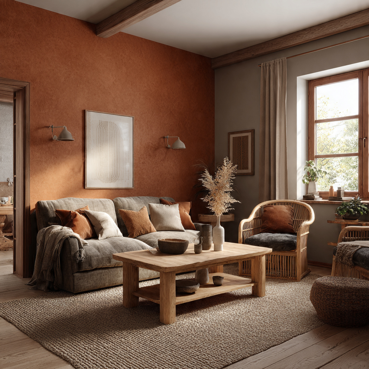
This idea centers on bringing the natural warmth of sun-baked earth and pottery into the home. Terracotta and clay tones are deeply comforting and currently very popular for creating a grounded aesthetic. Look for colors with strong reddish-brown or dusty rose undertones, such as Peach Fuzz (SW 6344) used sparingly as an accent.
Pairing these warm, rich colors with a muted green or a deep charcoal provides the necessary balance and contrast. The overall feeling should be organic, tactile, and warm, suitable for common areas where gathering is essential. These Sherwin Williams color palettes ideas emphasize natural materials and a handmade feel.
Soft Pastel Nursery Palette Ideas
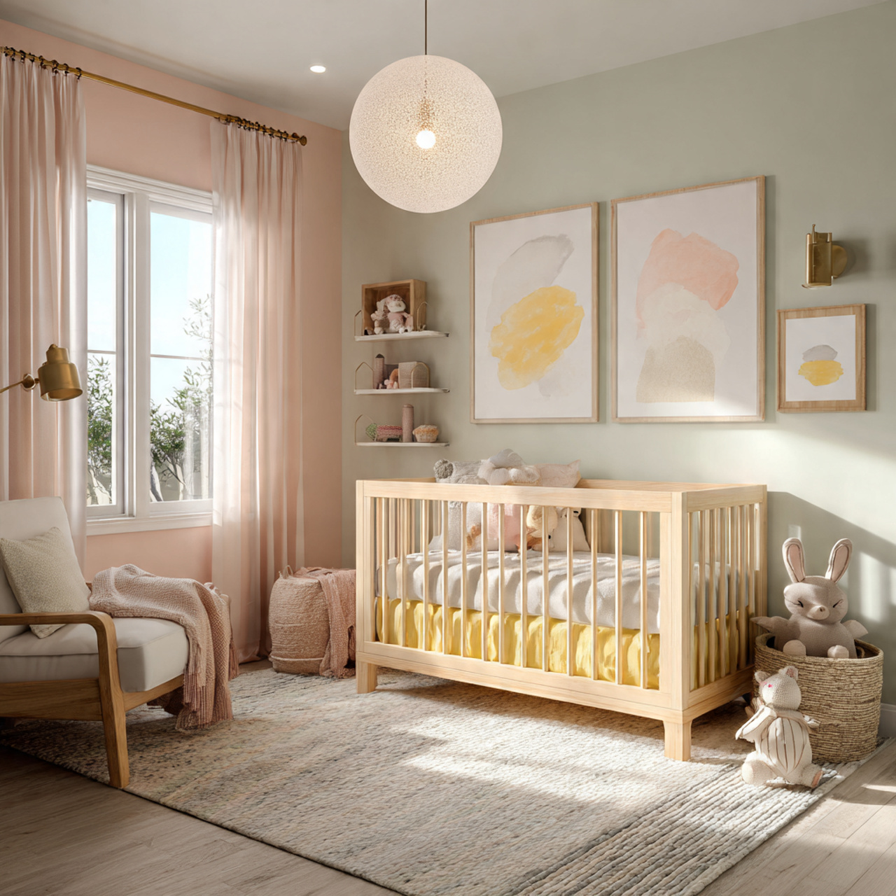
A pastel nursery palette should be gentle, whimsical, and calming, using very light, desaturated versions of primary colors. Think pale mint, baby blue, butter yellow, and blush pink. The main wall color should be a near-white with a hint of warmth, allowing the pastel accents to gently define the space.
The idea is to use the pastels in soft, welcoming ways, such as a half-painted wall, painted crib, or ceiling detail. A very soft, dusty blue like North Star (SW 6246) is perfect for a calming effect. These Sherwin Williams color palettes ideas are created to be soothing and supportive of a peaceful environment for the baby.
Moody Library Palette Ideas

Creating a moody library or study involves embracing deep, rich, and dark colors that evoke a sense of tradition and academic focus. Dark shades of blue, green, or even plum work best. A beautiful, dramatic choice is a saturated navy like Indigo Batik (SW 7602) on built-in shelving and walls.
The key to this idea is texture and lighting; the deep color provides the perfect backdrop for rich wood tones and warm, soft lighting. The use of a very crisp white on the ceiling or trim can provide a classic, formal contrast. These Sherwin Williams color palettes ideas are excellent for creating intimate, focused, and cozy spaces.
Monochromatic Blue Tones Ideas
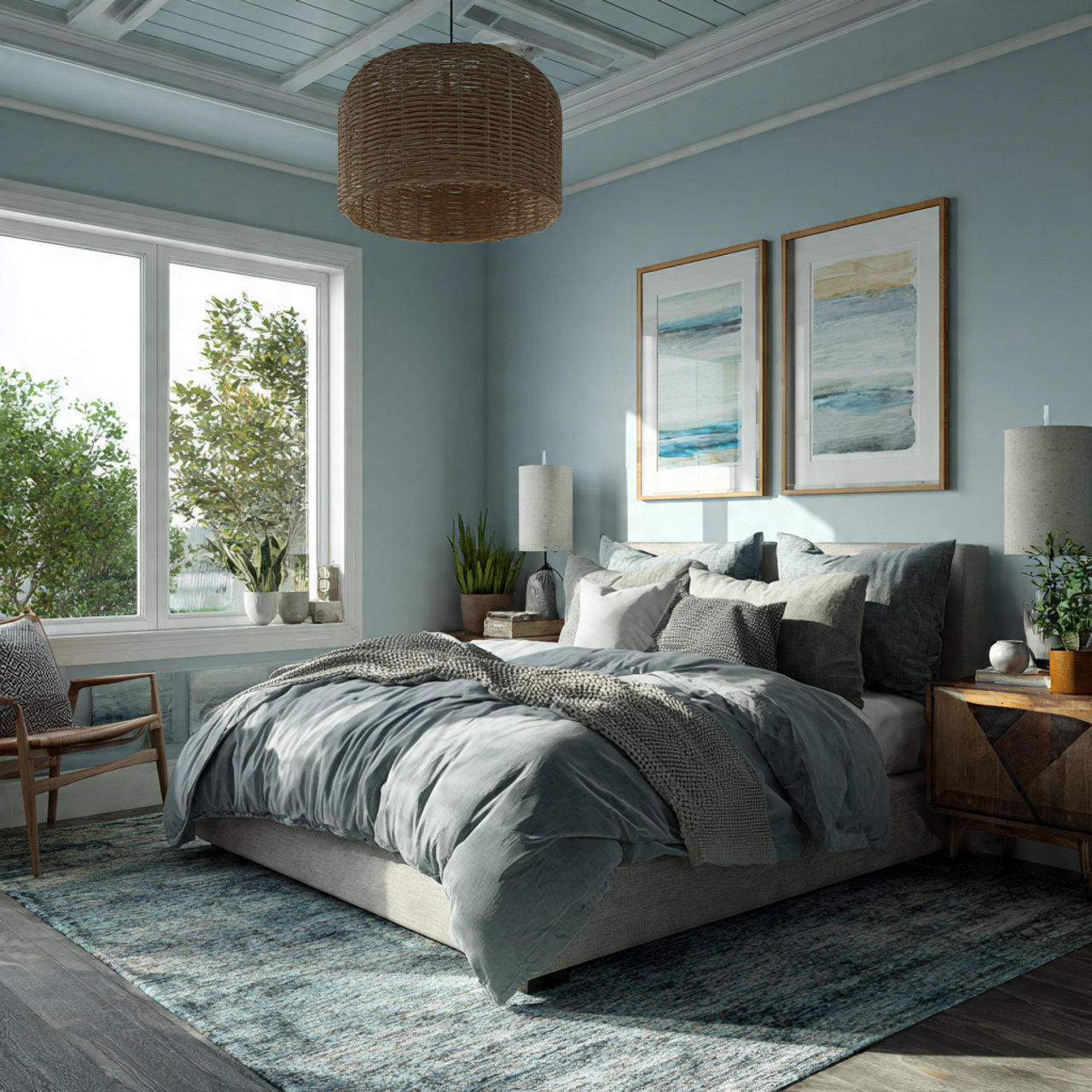
A monochromatic blue palette uses various shades, tints, and tones of blue to create a sophisticated, layered look that feels cohesive and expansive. Start with a mid-tone blue as the dominant color, and then introduce both lighter (for ceilings and accents) and darker (for trim and furniture) blues.
The depth is achieved by the subtle shifts in hue and value rather than contrasting colors. This concept works beautifully in bedrooms and bathrooms, where the color blue naturally instills a sense of calm. These Sherwin Williams color palettes ideas are a testament to the power of a single color family.
Complementary Color Pairing Ideas
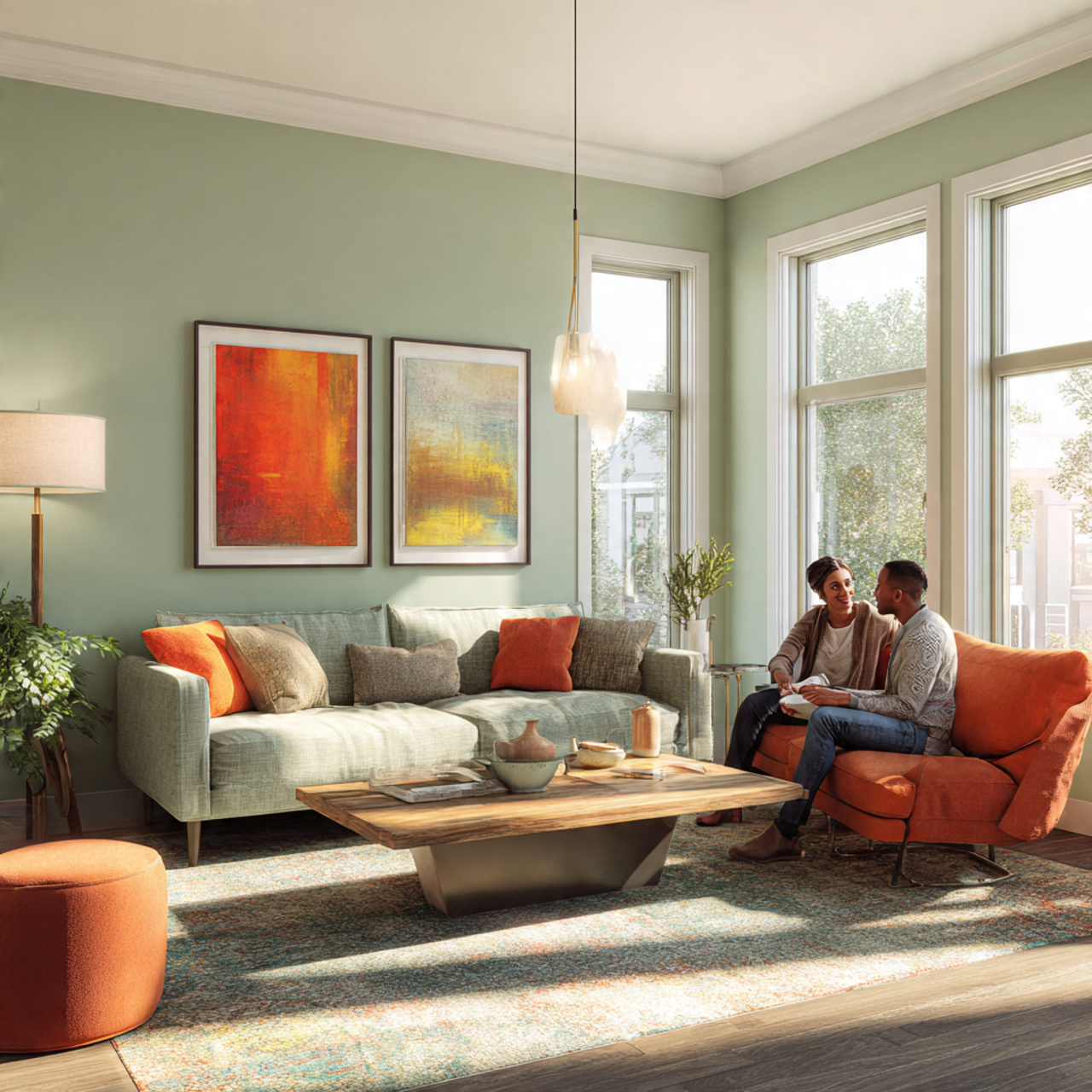
Complementary color pairing involves using two colors that are opposite each other on the color wheel (like blue and orange, or red and green) to create high contrast and energy. The idea is not to use them equally, but to let one dominate while the other serves as a vibrant accent.
For example, a soft, muted sage green wall can be dramatically paired with a single piece of artwork or textile in a deep, burnt orange. This technique provides visual excitement and definition. These Sherwin Williams color palettes ideas are for spaces that need a dynamic focal point and an immediate burst of energy.
High Contrast Trim Palette Ideas
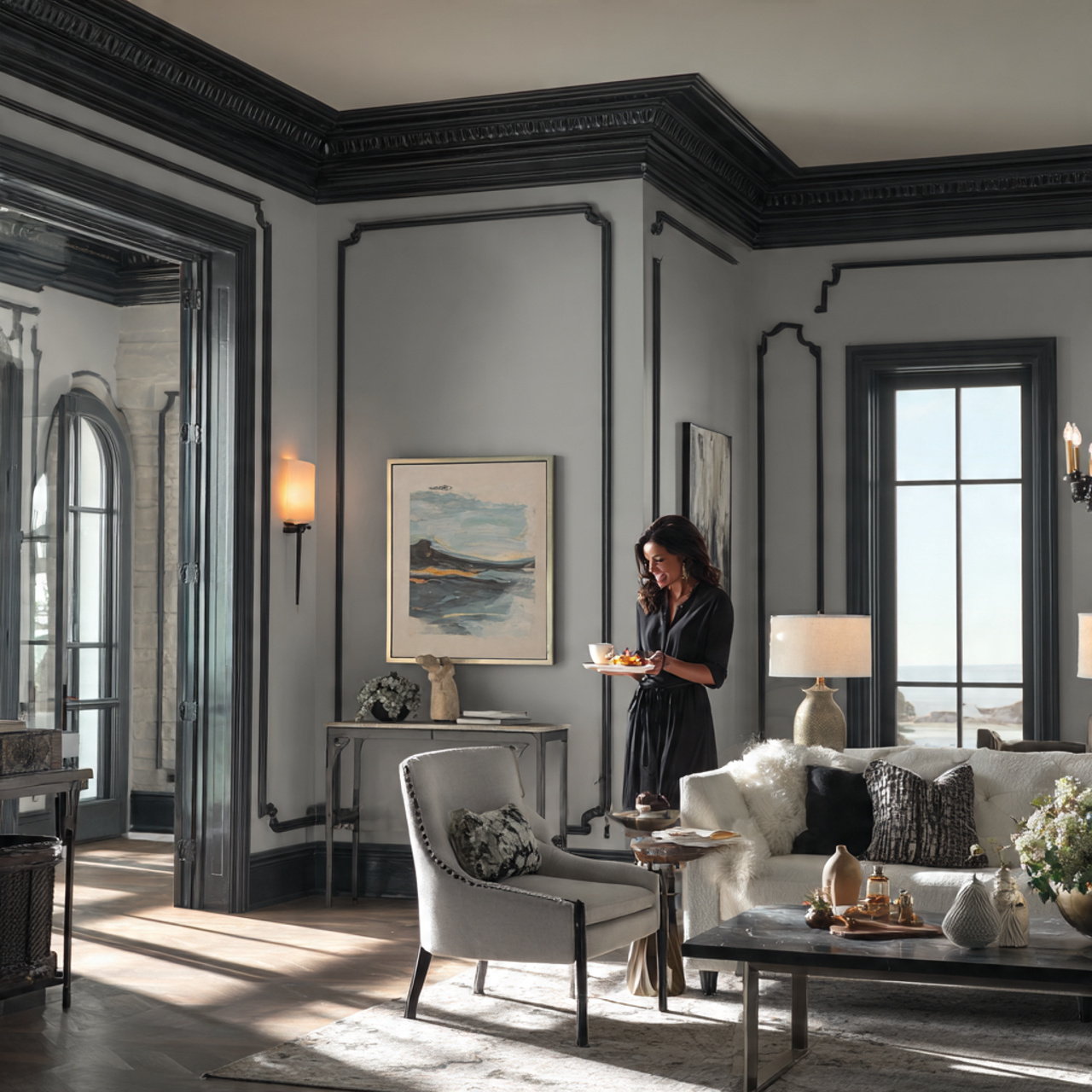
Traditionally, trim is painted white or a lighter shade than the walls, but the high contrast trim idea flips this script. It uses a very dark, dramatic color for the trim against a very light, neutral wall to emphasize architectural features. Imagine light gray walls paired with Tricorn Black (SW 6258) trim.
This technique is excellent for highlighting crown molding, door frames, and built-in shelving, giving a classic home a modern, graphic edge. The stark contrast adds definition and a bold, intentional aesthetic. These Sherwin Williams color palettes ideas are a simple way to update a traditional space.
Visit Also: Cozy Nook Inspiration
Seasonal Transition Palette Ideas
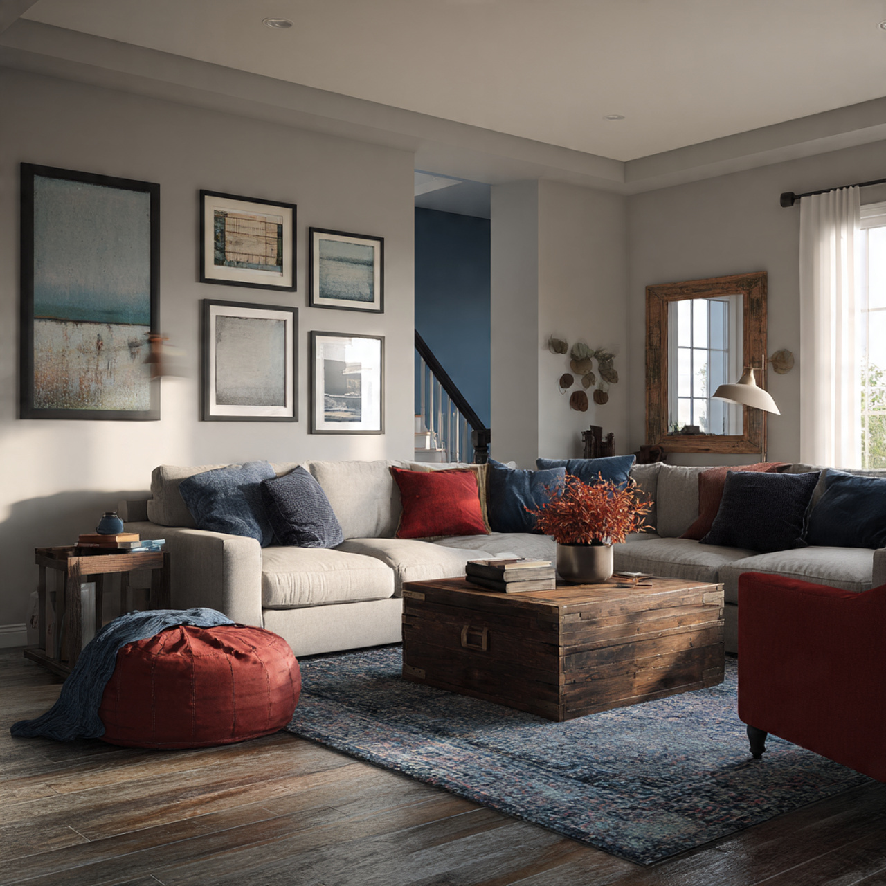
This palette is designed to feel comfortable and appropriate across all four seasons by using colors that are neither too warm nor too cool. It relies on versatile, balanced neutrals with complex undertones. Agreeable Gray (SW 7029) or Accessible Beige (SW 7036) are perfect core colors.
The idea is that these foundational colors can be easily accessorized with seasonal decor—warm browns and reds in the fall, cool blues and greens in the summer. They provide a calm, non-committal backdrop for a home whose style changes throughout the year. These Sherwin Williams color palettes ideas are about longevity and adaptability.
Timeless Neutral Foundation Ideas
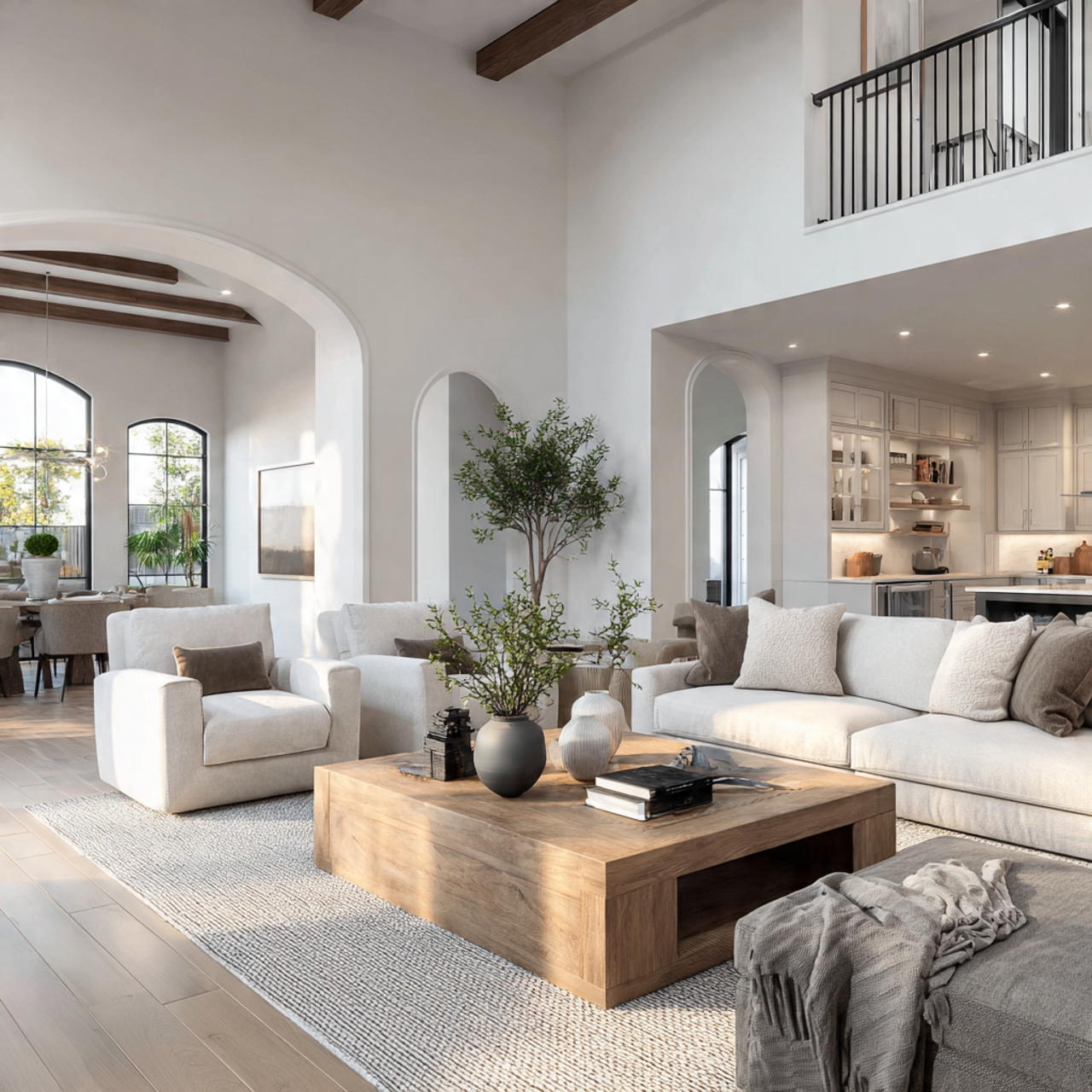
A timeless neutral foundation focuses on creating a base palette that will never feel dated, allowing furniture and decor to be swapped out freely. The palette is composed of sophisticated whites, creams, and light taupes that provide a soft, welcoming envelope. Think of colors like Shoji White (SW 7012) or Aesthetic White (SW 7035).
The trick is to ensure the neutrals have subtle, yet distinct, undertones (warm, cool, or greige) to avoid flatness. This idea is the definition of classic elegance and is perfect for large, open-concept spaces. These Sherwin Williams color palettes ideas are an investment in enduring style.
Bold Statement Entrance Palette Ideas
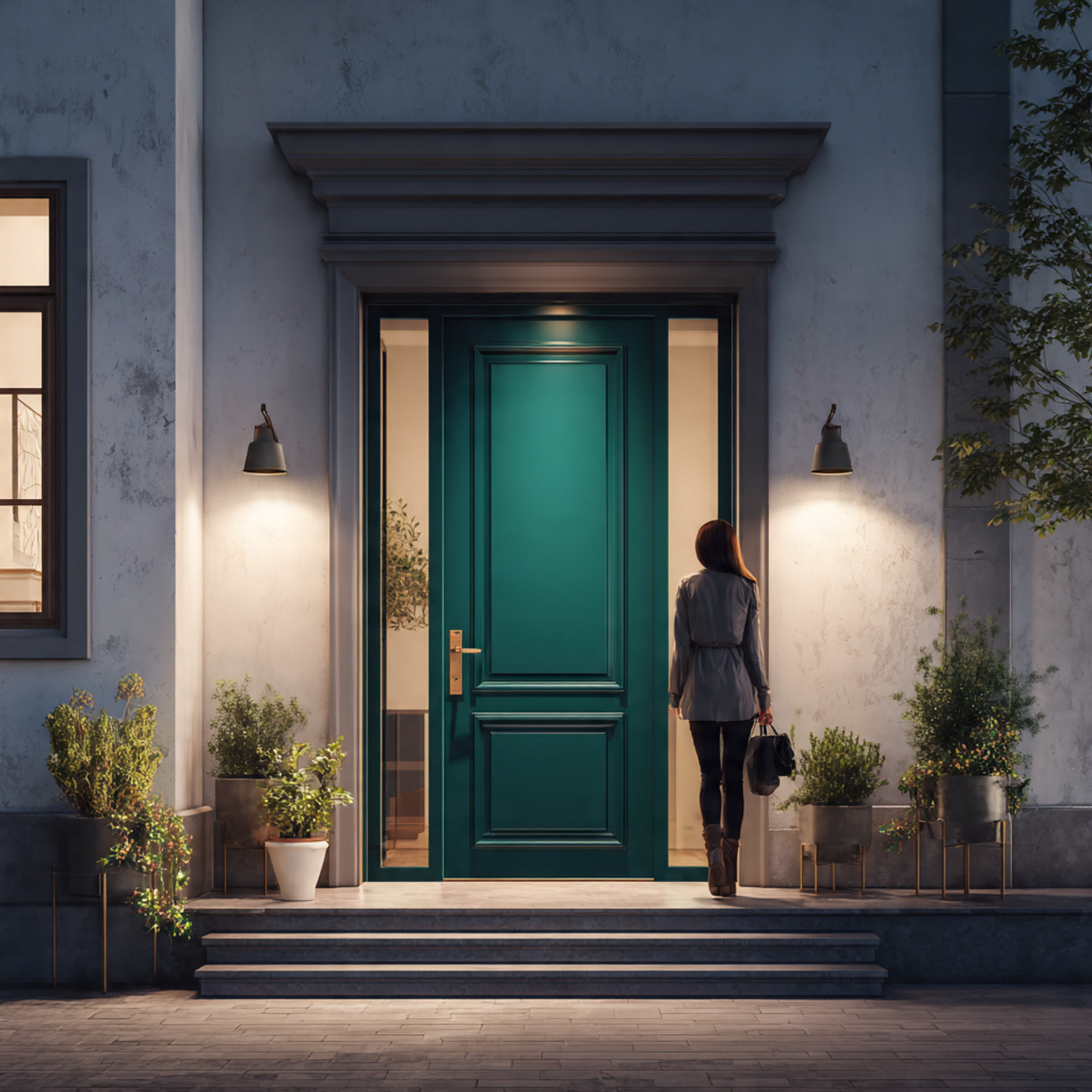
Your home’s entrance should make an immediate, impactful statement, and a bold color palette is the way to achieve it. Use a saturated, unexpected color on the front door or the entry walls to set a dramatic tone for the rest of the house. A deep green, rich teal, or even a sophisticated cranberry red can work wonders.
This is a great place to experiment with a color you love but wouldn’t commit to in a larger room. The idea is to create a moment of visual excitement that quickly transitions into a calmer, more neutral interior palette. These Sherwin Williams color palettes ideas are about creating a powerful first impression.
Office Productivity Palette Ideas
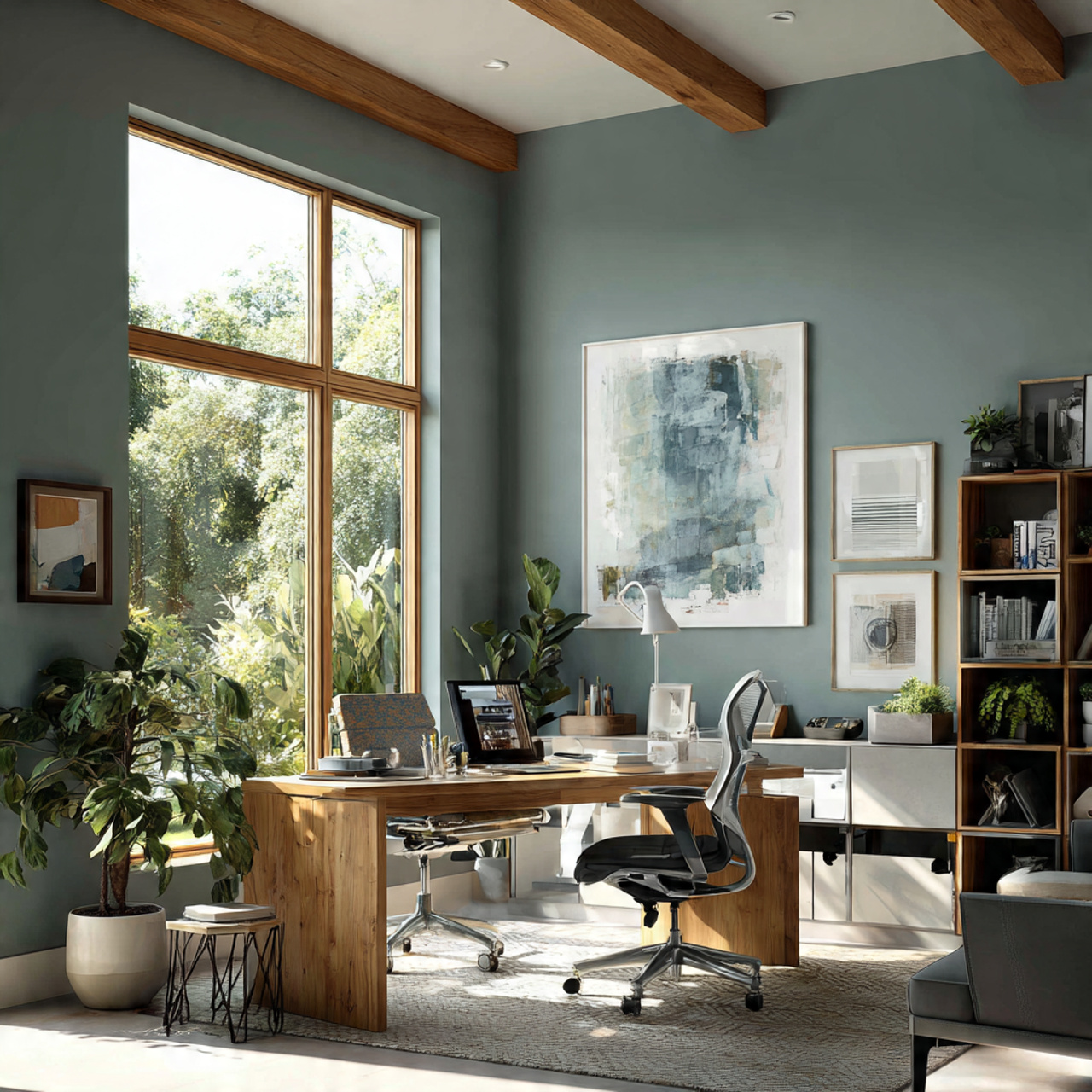
The office productivity palette uses colors specifically chosen to enhance focus, creativity, and a sense of calm. Blues and greens are often recommended for their calming and concentration-boosting properties. Consider a muted, thoughtful blue-green like Jasper Stone (SW 9133) for the main walls.
Avoid overly bright or distracting colors. The idea is to create an environment free of visual clutter that supports long hours of work. Use warm, deep wood tones and metals to ground the space, ensuring it feels professional yet inviting. These Sherwin Williams color palettes ideas prioritize cognitive function.
FAQs About Sherwin Williams Color Palettes Ideas
What are the most popular Sherwin Williams color palettes for living rooms?
The most consistently popular Sherwin Williams color palettes for living rooms typically center around warm greiges and balanced neutrals, such as those built with Agreeable Gray, Accessible Beige, or the foundational Alabaster. These provide a versatile, cozy backdrop that complements nearly any furniture style and allows for easy updates through colorful decor. The idea is to create a broad appeal and a highly welcoming atmosphere.
How can I easily combine a main paint color with trim and accent colors?
The simplest way is to select a main color and then choose a color two shades lighter or darker from the same Sherwin-Williams color strip for your accent wall, which guarantees harmony. For trim, choose a crisp, clean white like High Reflective White (SW 7757) if your main color is cool, or a slightly warmer white like Alabaster (SW 7008) if your main color is warm. This method ensures all elements of the Sherwin Williams color palettes ideas work together seamlessly.
Do Sherwin Williams color palettes change based on current design trends?
Yes, Sherwin Williams releases an annual Colormix Forecast that showcases trending palettes and colors, which strongly influences design for the upcoming year. For instance, the focus may shift from cool grays to warmer neutrals (like greige) or include a specific Color of the Year (like a dusty green). While timeless Sherwin Williams color palettes ideas remain, exploring the forecasts is a great way to stay current.
Where can I find pre-made Sherwin Williams color palettes for inspiration?
Sherwin-Williams offers several excellent resources, including their website’s “Color Palettes” section, which features curated collections like the “Historical Collection” or palettes based on specific styles (Coastal, Modern, Farmhouse). They also provide physical sample cards in their stores that display three or four complementary colors together, simplifying the process of finding coordinated Sherwin Williams color palettes ideas.
How do different lighting conditions affect a chosen color palette?
Lighting is crucial: natural light changes the color throughout the day, while artificial light can dramatically alter a hue. Colors tend to look cooler and bluer in north-facing rooms and warmer and yellower in south-facing rooms. The best idea is to always test large swatches of your intended Sherwin Williams color palettes ideas on the wall and observe them at different times of the day before committing to a final selection.
Conclusion
Exploring the vast world of Sherwin Williams Color Palettes Ideas is an exciting step in any decorating journey. The true beauty of these curated collections lies in their ability to remove the guesswork, allowing you to focus purely on creativity and the feeling you want to cultivate in your home. Don’t be afraid to pull inspiration from unexpected places—a favorite piece of art, a stunning landscape, or even a cherished memory—to guide your selection.
Ultimately, the best Sherwin Williams Color Palettes Ideas are the ones that spark joy and inspiration within your unique space. Use these ideas as a springboard to confidently select combinations that reflect your personality and transform your house into a harmonious and beautiful sanctuary designed entirely by you.

